Inventory the assumptions before changing the UI
Search the codebase for fixed screen widths, global screen references and layout branches based only on phone-versus-tablet identity. Treat each match as a review item, not automatically a bug.
For each branch, write the purpose in plain language: “show the sidebar when the content has room” or “keep the primary action reachable.” That makes it easier to replace a device-name condition with a condition about available space.
Separate SDK adoption from layout quality
Apple’s preparation talk explains the different screen usage associated with older SDKs, iOS 27 and iOS 27.1. Building against the new SDK enables the newer experience; it does not establish that your custom layout passes every state.
Run the existing workflow before polishing the empty state. A draft with the keyboard visible, a sheet over a selected item and a long localized label are more revealing than a blank list.
Review each edge independently
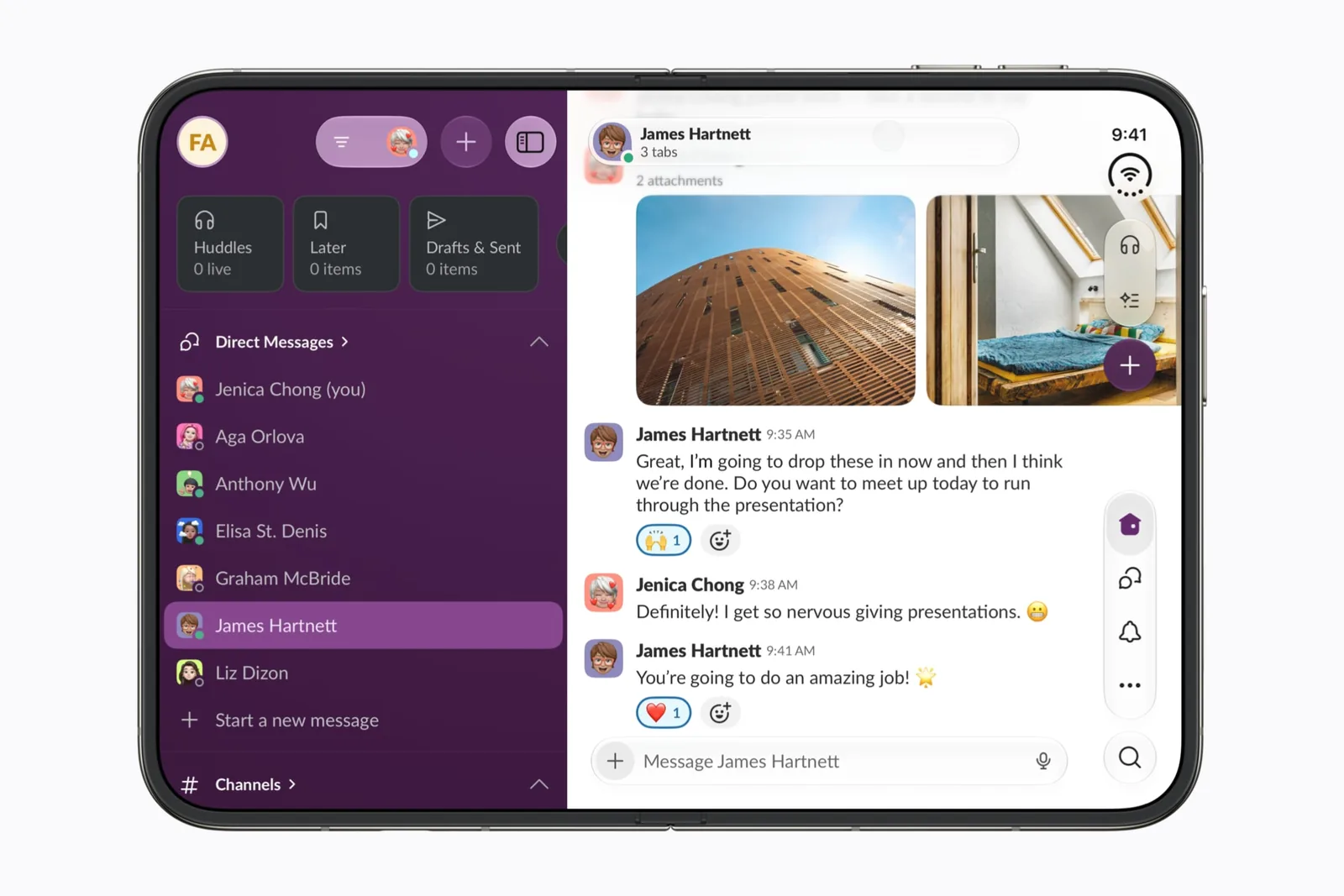
Apple calls out asymmetric safe areas and layout margins on Duo. Do not subtract one side’s inset twice and assume the other side matches. Test the same view on the left and right of Split View.
Our review prompt is to list every interactive control that touches an edge. For each, note the layout information it uses and the states that can change that information. Keep backgrounds and foreground controls as separate decisions.
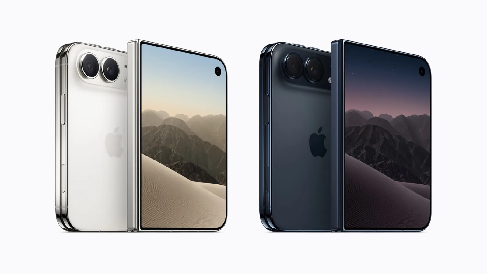
A render is no substitute for that review. It does make one easier to circulate: the 3D mockup studio puts a screenshot on either display at its published ratio, at any fold angle.
| Assumption to review | Replacement question |
|---|---|
| One global screen describes every view. | What space does this scene or view have now? |
| Phone layout means a fixed width. | Which size class and content constraints apply? |
| Left and right insets are equal. | Does each edge use its own inset? |
| A static screenshot proves the layout. | What happens with the keyboard, a sheet and selection? |
Keep the fold in the interaction review
Apple’s adaptive-layout talk describes reserved regions and displacement patterns for content around the hinge and cameras. Use the platform’s behavior where it fits before building an independent set of pose-specific layouts.
Choose one primary action in your app and follow it through the states. It should remain findable, with the same meaning, after the phone opens or folds. When custom controls move, review reading order and focus as well as their visual position.
Use a state-based test matrix
Make one row per user task, not one row per screen. Begin with an existing item selected. Test the outer display, inner display, relevant folded pose and both Split View sides. Add the keyboard or a presentation when the task uses one.
Use our downloadable testing checklist as a starting record. Its rows are intentionally small enough to repeat after a bug fix. Simulator results and physical-device results should be kept distinct.
Publish the scope of the update
A useful release note names the improvement: the selected draft survives opening, the toolbar clears the fold, or the reference remains readable beside another app. Avoid turning a new SDK build into an all-features compatibility claim.
Include a public source when you submit your app. The compatibility guide explains how that is presented to readers. This audit is a review framework, not a replacement for API documentation or a claim of a completed device test.
Sources & scope
Primary references. The claim beside each link sets its scope.
- Prepare your app for iPhone DuoApple Developer · Checked Sep 19, 2026
SDK-dependent screen usage, size classes, safe areas and Device Hub. Transcript reviewed.
- Strike a pose with adaptive layouts on iPhone DuoApple Developer · Checked Sep 19, 2026
Reserved regions and adaptive arrangements. Introductory transcript sections reviewed, not a complete API audit.
- Design for iPhone DuoApple Developer · Checked Sep 19, 2026
Design guidance and transcript: resizable layouts, controls, Split View and fold avoidance.